People do not read anymore. They scan, glance, and decide. So when your survey forces them to pick between “Option A” and “Option B,” you are asking them to think in text while they might be living in visuals.
That is where image surveys win. They turn a slow, word-heavy question into a fast visual choice.
Whether I’m testing a new product design, comparing marketing creatives, or trying to understand how users perceive our brand, image-based surveys always offer me deeper and more intuitive insights.
In this guide, I’ll show you how to design and use images as answer choices so your surveys look better, load faster, and collect cleaner insights. By the end, you will know how to build surveys that people enjoy answering and that you can actually trust.
What Are Image Surveys (And Why They Work)
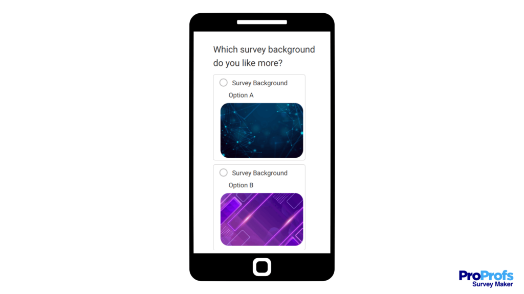
An image survey is a survey that replaces words with visuals. Instead of asking someone to read a list of options, you show them pictures and let their brain do what it does best: recognize, compare, and react.
You have seen this before.
- “Which logo feels more trustworthy?”
- “Which ad would you click?”
- “Which branch layout looks more inviting?”
These are image surveys. They work because people process visuals faster than text and make instinctive choices without overthinking.
When you use images as answer choices in surveys, you cut through language barriers and make your survey feel more like a conversation than a chore. You also get better completion rates because people spend less time reading and more time reacting.
But the magic is not automatic. Images can just as easily mislead respondents if they are inconsistent in size, style, or placement. A slightly brighter photo can tilt the data without you realizing it. That is why image surveys are not just about adding pictures. They are about designing controlled, repeatable visuals that measure true preference, not presentation bias.
If you build them right, image surveys will show you not only what people choose but also what they feel. And that kind of feedback is what turns data into decisions.
How to Use Images as Answer Choices in Surveys
Using images as answers is not just a design upgrade. It is a data upgrade. When people can respond visually, they stop overthinking and start reacting, and that reaction is gold for feedback.
Here’s how to use images as answer choices in surveys:
1. Define the Decision You Are Measuring
Every good survey starts with one clear question: What are you actually trying to learn?
When you add images, it’s tempting to include everything, such as products, mockups, and concepts, and hope the visuals “speak for themselves.” They don’t. You need a defined decision behind every question.
Are you measuring preference (which design people like), recognition (which version they remember), or emotion (which one feels trustworthy, calm, or exciting)? Each of these needs a slightly different visual setup.
If you skip this step, your data will look busy but tell you nothing. People will choose at random because they are not sure what you want from them.
Here is a quick way to frame it:
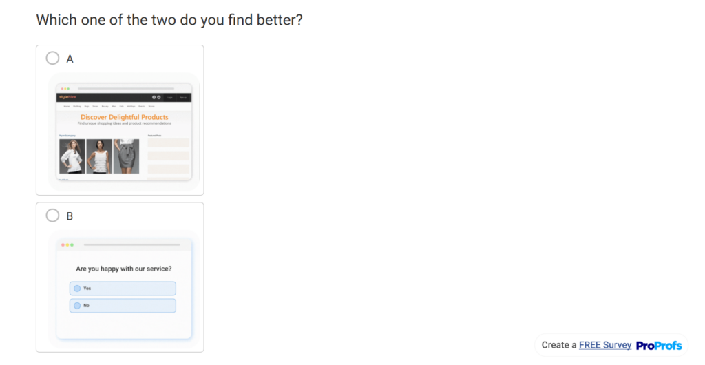
- Preference: Show two or more visual options side by side. Ask “Which would you choose?”
- Recognition: Test recall by showing visuals that respondents saw earlier.
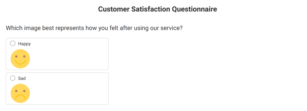
- Emotion or perception: Ask “Which image best represents how this makes you feel?”
Define the decision first, and every other step (from image selection to analysis) becomes obvious. Otherwise, you are just decorating a form and calling it research.
2. Prepare Consistent Visual Assets
Your images are your data. If one looks brighter or sharper than the others, people will pick it for the wrong reason. Consistency ensures that choices are fair and your insights are reliable. Here is how to prepare your visuals before uploading them.
- Collect all images in one folder. Keep your working files organized so you can check them in sequence before upload.
- Use the same dimensions for every image. Aim for a standard square or 4:3 ratio. Resize them together using any editor so none appear larger or cropped.
- Match resolution and quality. Keep all files at web quality — usually 72 DPI — and under 200 KB for faster loading.
- Unify lighting and background. Use a neutral or white background if possible. Avoid high-contrast or colored backdrops that change the visual tone.
- Name your files logically. For example, “Q1_OptionA.jpg,” “Q1_OptionB.jpg.” This helps when analyzing data or replacing visuals later.
- Test your set visually. Open all images side by side. They should resemble variations of the same idea, rather than completely different moods.
- Save a copy of your final set. Keep both a working and final folder, so you can revert or reuse images in future surveys.
When your visuals feel identical in everything except their content, you know they are ready. That is the point where design stops influencing the response, and the respondent’s instinct starts.
3. Choose the Right Tool
If you have ever tried building a visual survey inside a generic form builder, you already know the pain. When I first tried adding image choices to a survey, I used a tool that treated every upload like a favor. The layout broke, the mobile preview froze, and by the end, I was doing more design work than data work.
That is why your choice of tool matters more than most people think. You need something that handles visuals natively and does not turn every question into a formatting project. This is why I moved to ProProfs Survey Maker; not because it was fancy, but because it actually understood that visuals are data, not decoration.
If you are using ProProfs Survey Maker, here is exactly how to set up image answer choices:
Below are the steps in detail, so you don’t get lost midway:
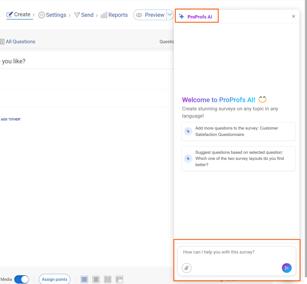
- Create your survey, either using AI survey builder or manually. You can also edit an existing one.
- Locate the Image option on the right side of your answer options.
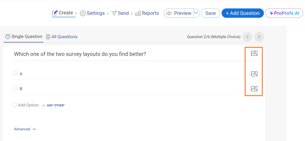
- Choose what to upload. You will see three options: Image, Video, and Upload.
- Use Image for pictures.
- Use Video for short clips.
- Use Upload if you want to attach another file type, or you want to browse an image from your computer.
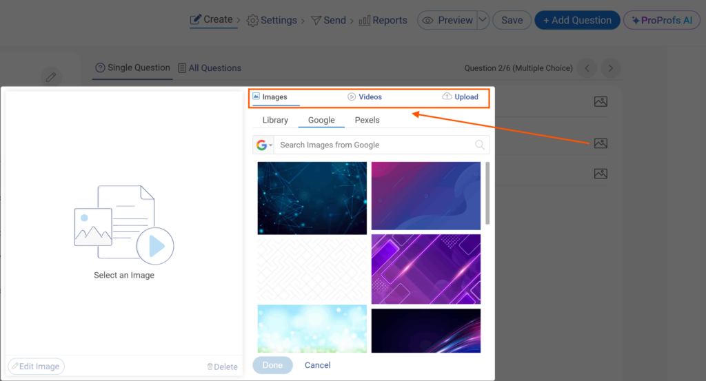
- Add images to your answer choices. When you create options A, B, and C, click Image next to each one to upload visuals that correspond to those choices.
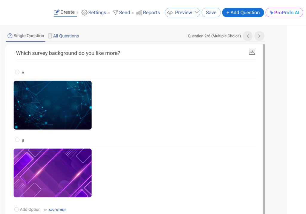
- Preview your question. Check how each image appears beside its label.
4. Limit Options to Reduce Friction
Keeping your visuals limited is not just theory; it is an execution step. Here is how to actually set the limit while building your survey.
- Upload all the potential visuals you plan to use for that question. You can add as many as you want at this stage — this is just your working library.
- Preview them inside your survey tool. See how they appear side by side. Focus on readability and loading speed.
- Check the viewport. Make sure every option fits on one screen without scrolling. If users have to scroll to see all choices, trim the list.
- Cut down to four to six images. Start by removing duplicates or options that test the same idea.
- Renumber and clean the layout. Once you have your final set, relabel the answer choices (A, B, C, etc.) so they appear in a single visual block.
- Run a test preview. Send it to a colleague or test device. Watch how quickly they can view and select an image. If they hesitate, you still have too many.
By running this quick filter every time, you will keep the question focused, fast to load, and simple enough for users to make a real choice.
5. Add Short, Clear Captions
Captions anchor your visuals. They tell people what they are looking at without stealing attention from the image. A good caption adds clarity. A bad one adds bias.
Follow these steps:
Stick to facts. Describe what the image shows. Use clear identifiers such as “Logo Option A,” “Homepage Layout 2,” or “Packaging with Handle.”
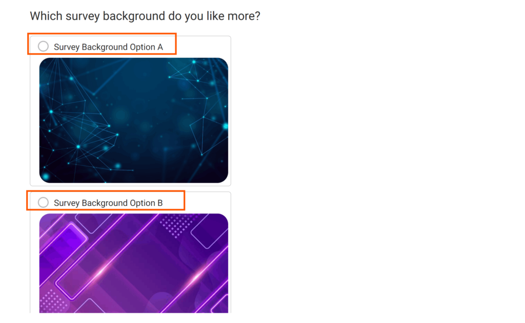
- Write captions before uploading. Draft a short label for each image, no longer than a few words. Keep it descriptive, not persuasive. For example, “Blue Bottle Design” works better than “Modern Blue Bottle.”
- Keep tone and length consistent. If one caption sounds formal and another conversational, people will react to the tone instead of the image.
- Avoid emotional or leading words. Do not use words like best, premium, or favorite. You are not selling the image, you are testing it.
- Preview on mobile. If any caption wraps into multiple lines, shorten it until all fit neatly on one screen.
Captions work best when they disappear into the background. Their job is to guide the choice, not influence it.
6. Randomize Image Order
People do not pick at random. They pick what they see first. If your images always appear in the same order, you are not testing preference, you are testing position. Randomizing removes that bias.
Here is how to do it right:
- Turn on randomization in your survey tool. Most platforms, including ProProfs Survey Maker, have a random order toggle in the question settings. Enable it before launch.
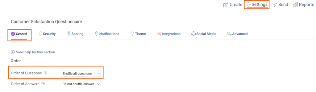
- Randomize every time the survey loads. Do not rotate in a fixed pattern. Each respondent should see a unique order.
- Check layout balance. After randomization, preview a few versions to ensure spacing and alignment still look clean.
- Apply randomization only where needed. Use it for image-choice questions, not for sequences that rely on logical flow, like rating scales or ordered tasks.
- Document randomization settings. Record whether the question was randomized. This helps when reviewing results or comparing campaigns later.
When every respondent sees a different order, your data reflects genuine preference, not the luck of placement. That small setting separates a good survey from a biased one.
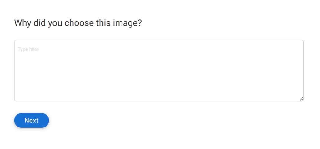
7. Add a One-Line Why Prompt
An image survey tells you what people chose, not why they chose it. That gap is where most feedback loses its value. Adding one short follow-up question after each image choice fills that gap without slowing the survey.
Here is how to build it in:
- Add a short text field after the image question. Use a simple follow-up like “Why did you choose this image?” or “What made this option stand out?”
- Keep it optional but visible. Most respondents will answer if the box is there, but forcing it can backfire.
- Limit responses to one or two lines. You want quick instinctive notes, not essays.
- Preview how it appears on mobile. The text field should sit close to the images so users connect their response to their choice.
- Tag the responses by image ID. This way, when you analyze results, every “why” maps directly to the chosen visual.
That one line of context can change how you interpret the data. It separates “they liked the color” from “they trusted the brand.” Without it, every choice is just a guess.
8. Use Logic To Go Deeper Only When Needed
Not every answer deserves a follow-up, but the right one at the right time can reveal what a static question never could. Logic helps you dig deeper without making the whole survey heavier.
Here is how to use it well.
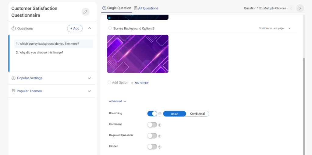
- Set conditional logic in your tool. In ProProfs Survey Maker, open the question settings and use branching or skip logic to show specific follow-ups only when a certain image is selected.
- Decide which answers trigger detail. For example, if a respondent picks an unusual option, send them to a “What influenced your choice?” question.
- Keep branches simple. One extra question per branch is usually enough. Long logic trees slow users down and create uneven data.
- Test each path manually. Preview every possible route to make sure the logic flows and nothing dead-ends or loops.
- Track which logic triggered. When you export results, mark which follow-ups appeared. It helps you filter later when analyzing open responses.
Logic is not about making surveys feel smarter. It is about keeping respondents focused while pulling deeper insight only where it matters.
Once your image survey is built and logic is in place, the next phase is about polish. The difference between a functional survey and a great one comes from the smaller details — how the visuals feel, how people interact with them, and how the experience flows.
That is where best practices come in.
Best Practices For Image Surveys
You have the steps down. Now it is time to sharpen what you have built. These image survey best practices come from the parts that break most often in real projects; the things you only learn after you have run a few dozen surveys and cleaned the messy data afterward.
1. Keep the Experience Light
People click faster when the survey feels fast. Avoid heavy images or long pages. Split questions across screens if needed, so every page loads instantly. A slight delay on mobile can double your drop rate.
2. Test Emotion, Not Just Preference
An image survey is not just about “which design they like.” It is about how it makes them feel. Add questions that capture emotion or perception. For example, “Which image feels more trustworthy?” often gives better direction than “Which image do you prefer?”
3. Make Accessibility Part of the Design
Add alt text, use readable color contrast, and keep captions visible. You will not only include more respondents but also protect your data quality. Accessibility errors do not just block users — they create invisible bias.
4. Keep Your Images Culturally Neutral
Avoid using symbols, gestures, or colors that have different meanings in different regions. A simple thumbs-up or a red background can have a very different meaning in another culture. When in doubt, keep visuals plain and descriptive.
5. Always Preview on Mobile
You will spend hours designing on a laptop and forget that most people will answer on a phone. Test your survey on different screen sizes. If any image or caption breaks alignment, fix it before launch.
6. Blend Quantitative & Qualitative Data
Do not settle for just click counts. Pair image selections with short “why” responses or follow-up questions. The combination turns numbers into reasons, which is where actual insight lives.
7. Create Templates for Future Surveys
Once you have nailed your layout, save it as a reusable template. The next time you run an image survey, you should be testing the content, not rebuilding the structure.
8. Think Real Time
If your tool allows, track responses as they come in. Seeing early patterns helps you pivot fast: swap an image, reword a caption, or remove an underperforming option before the survey ends.
How to Match Your Image Type to the Decision You’re Testing
Not every question needs a photo. Sometimes a clean icon tells you more. Other times, a real image is the only way to test what people truly notice. The trick is matching the image type to the decision you want people to make.
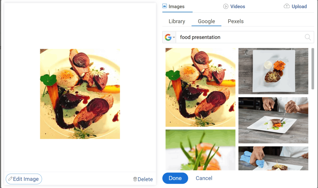
1. Use Photos for Real-World Choices: When you want to measure how people respond to real objects or spaces, use photos. Packaging, store layouts, food presentation, and branch interiors all belong here. Photos give realism, and realism gets you honest reactions.
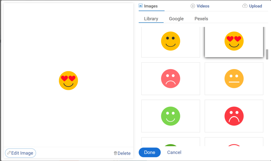
2. Use Icons for Simple Feelings: Icons work when you are testing recognition, mood, or clarity. If you are asking which feature represents trust, safety, or speed, icons remove distraction. They keep attention on the concept, not the detail.
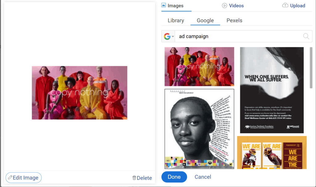
3. Use Illustrations for Concept Tests: When you are validating an idea that does not exist yet, illustrations work better than photos. They allow imagination without implying a finished design. Use them for early prototypes, app flows, or campaigns that are still in sketch form.
4. Use Screenshots for Digital Feedback: Screenshots are perfect when you are testing UI or UX changes. Ask which version feels easier to use or cleaner to look at. People react faster to interfaces they can picture themselves using.
5. Match the Image to the Task: If the goal is emotion, use symbolic or expressive visuals. If the goal is choice, use realistic ones. The type of image defines the quality of the data. Use the simplest format that captures the intent of the question.
Choosing the right image type is what separates random clicks from meaningful decisions. Once your visual form matches your question’s purpose, your survey starts working for you, not against you.
FREE. All Features. FOREVER!
Try our Forever FREE account with all premium features!
Real Examples: What Good Looks Like
You do not need perfect visuals to run a good image survey. You just need controlled ones. Here are a few examples that show what works and what usually goes wrong.
Example 1: Product Comparison
| Good | Bad |
|---|---|
| 2-4 bottle designs, same background, same lighting, labeled A–D. | 10 bottle photos, different angles and lighting, no labels. |
| Loads fast and fits on one screen. | Takes five seconds to load and needs scrolling. |
| Data shows clear preference by design. | Data shows bias toward brighter or larger images. |
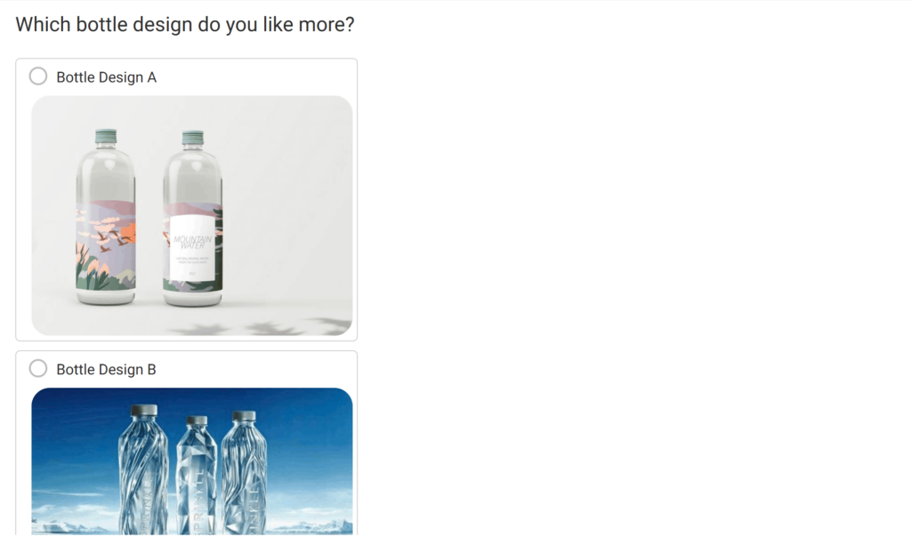
Takeaway: Consistency beats variety. When every option looks equally polished, people choose based on content, not presentation.
Example 2: Emotion-Based Feedback
| Good | Bad |
|---|---|
| Icons representing moods — happy, neutral, frustrated. | Stock photos of people with unclear expressions. |
| Works across languages and cultures. | Misinterpreted easily, especially across regions. |
Takeaway: Simpler visuals reduce confusion. The clearer the meaning, the cleaner your data.
Example 3: UI Preference Test
| Good | Bad |
|---|---|
| Two clean screenshots with clear labels: “Layout A” and “Layout B.” | Three blurred screenshots cropped at random. |
| Same resolution and device frame. | Mixed screen sizes, misaligned text. |
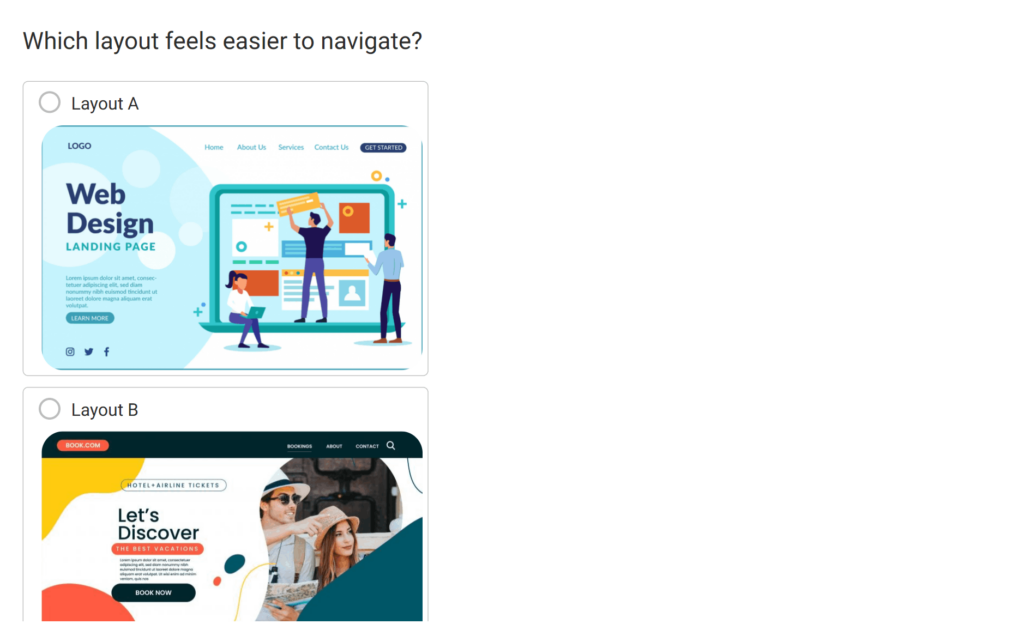
Takeaway: If you are testing digital experiences, test them in context. People react differently when the image looks like something they would actually use.
The goal is not design perfection. It is design control. When every visual variable is stable, the choice your respondents make finally means something.
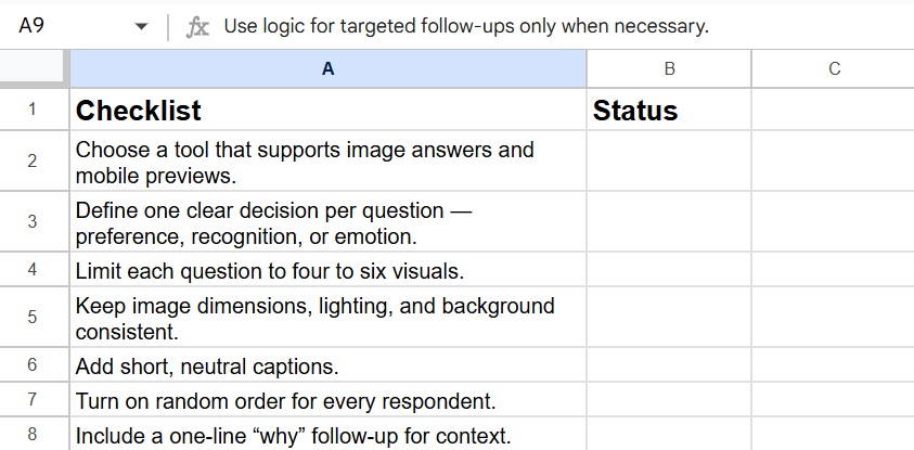
Here’s a quick checklist for you to tick whenever you are creating image surveys:
What Usually Goes Wrong & How to Stay Out of Trouble
Even well-designed image surveys can fail because of small, avoidable errors. Use this table as a quick pre-launch checklist.
| Issue | What Happens | How to Fix It |
|---|---|---|
| Uneven image quality | Respondents pick the best-looking image, not the best option. | Keep all visuals identical in size, lighting, and framing. |
| Too many choices | People get decision fatigue and click at random. | Limit each question to four to six images. |
| No randomization | Results get biased toward images that appear first or on the left. | Turn on random order for every respondent. |
| Missing alt text | Screen readers cannot describe images; accessibility fails. | Add clear alt text to every visual. |
| Unlicensed images | Risk of copyright violations or takedown notices. | Use original or royalty-free visuals only. |
| Privacy slip-ups | Uploaded files may include faces or private data. | Remind users not to share personal info and delete uploads after review. |
| Collecting unnecessary data | Creates compliance risk and erodes trust. | Only collect what you need for the study. |
| Ignoring local laws | Violates GDPR, CCPA, or regional data rules. | Review your compliance checklist before launch. |
Turning Image Surveys Into Reliable Insights
An image survey is not about making your form prettier. It is about removing friction between what people feel and how they respond. When visuals are done right, they cut through reading fatigue, language barriers, and hesitation. You get reactions that are faster, cleaner, and closer to instinct.
The work is in the details. Consistent lighting, random order, short captions, and a one-line “why” — these are what keep your data honest. They turn an image survey from a design experiment into a real decision tool.
And if you are using a new-age survey maker, you already have the framework to do it.
Start small, and you will see it. Replace one text question with images in your next survey. Watch how quickly people respond, and how different the insights feel. Once you see that difference, you will not go back.
Frequently Asked Questions

What are the four types of surveys?
The four main survey types are descriptive, analytical, exploratory, and causal. Descriptive surveys capture facts, analytical ones find patterns, exploratory surveys surface ideas, and causal surveys test cause and effect. Together, they cover everything from understanding users to predicting how a design or image drives behavior.
What is a brand image survey?
A brand image survey measures how people perceive your brand visually and emotionally. It captures what your logo, colors, or tone make them feel. Using image questions like “Which design feels more reliable?” helps you see whether your visuals align with the identity you want people to remember.
How do image surveys improve data quality?
Image surveys speed up response time and reduce cognitive fatigue. People make instinctive choices when they see visuals instead of reading long text. As long as your images are consistent and unbiased, you get cleaner, more reliable data because respondents react naturally instead of overanalyzing every word.
How can enterprises scale image surveys across teams?
Large teams can scale image surveys by standardizing templates and visual rules. Define image size, caption format, and randomization once, then share that framework across departments. Tools like ProProfs Survey Maker make this easy, so everyone collects data the same way without losing flexibility or visual quality.
FREE. All Features. FOREVER!
Try our Forever FREE account with all premium features!
 We'd love your feedback!
What did you like & how can we make it even better?

 Thanks for your feedback!
 Ask Your Question
Have a question? Get expert help to make your decision easier.