

You ran the survey, the responses are in, and now you are staring at a spreadsheet that has absolutely no intention of explaining itself.
Most teams are great at collecting survey data. Writing questions, setting up the form, and hitting send. What nobody prepares you for is what comes next: how to analyze survey data!
That gap is where most survey efforts quietly fall apart. Not because the data was bad, but because there was no clear process for making sense of it.
This guide gives you that process. A 10-step checklist, a plain breakdown of every major analysis method, a real end-to-end example, and enough practical frameworks to walk into any room and confidently explain what your data is telling you.
No statistics degree required.
What Is Survey Data Analysis, and Why Does It Matter?
Survey data analysis is the process of cleaning, interpreting, and drawing conclusions from survey responses to inform decision-making. It covers everything from calculating average satisfaction scores to finding out why a specific customer segment is quietly unhappy.
Think of it as the bridge between asking and understanding.
Most businesses stop at the asking part. They send out a survey, glance at the overall scores, and call it a day. The problem is that overall scores almost never tell the full story.
Done well, survey data analysis helps you:
- Understand what your customers, employees, or users actually think, not just what you assume they think
- Identify which segments of your audience are thriving and which are struggling
- Make budget, product, and strategy decisions backed by real evidence
- Track whether things are getting better or worse over time
- Present findings to stakeholders in a way that leads to action, not debate
Forrester reports that customer-obsessed firms achieve up to 3.5x revenue growth when aligning brand and customer experiences.
Collecting data is the easy part. Knowing what to do with it is where the real work begins.
How Do You Prepare & Clean Survey Data Before Analysis?
Most guides skip straight to the analysis methods. That is exactly why so many teams end up with findings that feel off, inconclusive, or impossible to act on. The quality of your analysis is only as good as the quality of your data.
Before you touch a single number, you need to do two things: set your intention and clean your dataset.
Start With Your “So What” Question
Do not start with the data. Start with the decision you need to make.
If you ran a customer satisfaction survey, the question is not “what is our score?” The question is “which customer segment is most at risk, and what is driving that?” That single question tells you which cross-tabulations to run, which open-ended responses to prioritize, and what number belongs in your executive summary.
Here are three examples of strong starting questions by survey type:
| Survey Type | Weak Starting Point | Strong "So What" Question |
|---|---|---|
| Customer Satisfaction | What is our CSAT score? | Where is satisfaction lowest, and what is causing it? |
| Net Promoter Score | What is our NPS? | Which segment gave us detractors and why? |
| Employee Engagement | Are employees happy? | Which departments are disengaged, and what do they say is missing? |
Do You Have Enough Responses to Draw Conclusions?
This is one of the most common pain points teams run into and one of the least addressed. Here is a simple reference before you begin:
| Survey Type | Minimum Responses | What You Can Reliably Do With It |
|---|---|---|
| Customer Satisfaction | 100+ | Segment by product line or channel |
| Employee Engagement | 50+ per department | Identify departmental variation |
| Net Promoter Score | 200+ | Split promoters, passives, and detractors meaningfully |
| Product Feedback | 30+ | Directional insight only, not generalizable |
| Market Research | 385+ | Statistically significant at 95% confidence |
Any subgroup with fewer than 30 responses should be labeled directionally only in your report. Do not build a strategy on it, but do not discard it either. Flag it and investigate further.
How Do You Clean Survey Data Before Analysis?
Cleaning is not about removing inconvenient answers. It is about making sure your final dataset actually reflects your real audience. Here is what to look for and remove:
- Speeders: Respondents who completed the survey in an unreasonably short time, typically under 30% of the median completion time
- Straight-Liners: People who selected the same answer for every single question, regardless of content
- Duplicates: Identical IP addresses or respondent IDs appearing more than once
- Incomplete Responses: Anyone who answered less than 70% of the questions, though you should assess this threshold based on your survey length
- Out-of-Context Responses: Open-ended answers that are clearly nonsensical or entirely off-topic
Research professionals typically remove 10-20% of raw responses during cleaning. If you are removing more than 25%, the problem is likely in your survey design or distribution method, not the respondents.
One practical note on incomplete responses: do not delete everything that is partial. A respondent who skipped the demographic fields but fully answered your satisfaction questions is still valuable for overall scoring. Exclude them only from demographic cross-tabulations.
What Are the Main Survey Analysis Methods, and When Should You Use Each One?
There is no single best way to analyze survey data. The right method depends on what your data looks like and what question you are trying to answer.
Here is a breakdown of every major survey analysis method, when to use it, and what it actually tells you.
1. Descriptive Statistics: What Did People Actually Say?
Use It When: You need a baseline picture before digging deeper.
What It Tells You: Averages, percentages, and how often each option was selected.
The most important rule: never report the mean alone. A satisfaction score of 3.8 out of 5 looks fine until you see that 40% rated you a 2 and 40% rated you a 5. That is not a moderately satisfied audience. That is a polarized one, and it needs a completely different response.
Always pair your average with the distribution.
2. Cross-Tabulation: Does the Answer Change Depending on Who You Ask?
Use It When: You suspect different groups are having different experiences.
What It Tells You: How responses vary across segments like age, location, tenure, or customer tier.
This is the most powerful method for non-technical analysts because it requires no specialist software and consistently surfaces what overall averages hide.
Quick Example: Your overall CSAT is 72%, which looks acceptable. You cross-tabulate by office location and discover that Chicago is at 45%, while New York is at 91%. Without the cross-tab, you call 72% good enough. With it, you have a specific problem to solve.
You can run cross-tabulations using pivot tables in Excel, Google Sheets, or built-in filters in most survey tools.
3. Correlation Analysis: Do These Two Things Move Together?
Use It When: You want to understand the relationship between two variables.
What It Tells You: Whether two things tend to move in the same direction, not whether one caused the other.
This distinction matters more than most people realize. Before acting on any correlation, ask what else changed in the same period and identify at least two alternative explanations before drawing conclusions.
Thematic Analysis: What Are People Actually Trying to Tell You?
Use It When: You have open-ended responses that need to be organized into patterns.
What It Tells You: The recurring themes, concerns, and sentiments hiding in written feedback.
For Under 200 Responses, Use Manual Coding:
- Read all responses once without tagging, just to absorb the range
- On the second pass, tag each response with one to three keywords
- Group similar keywords into themes
- Count frequency and rank by emotional intensity, not just volume
For Over 200 Responses, Use AI-Assisted Coding: Run sentiment analysis or NLP tools, or work with an AI agent for data analysis to generate initial clusters, then do a human review pass. Automated tools frequently misread sarcasm, technical language, and industry-specific context. Treat them as a starting point, not a final answer.
Benchmarking: How Do You Stack Up?
Use It When: You need context to interpret whether your scores are good, bad, or average. What It Tells You: Where you stand relative to industry standards.
| Survey Type | Minimum Responses | What You Can Reliably Do With It |
|---|---|---|
| Customer Satisfaction | 100+ | Segment by product line or channel |
| Employee Engagement | 50+ per department | Identify departmental variation |
| Net Promoter Score | 200+ | Split promoters, passives, and detractors meaningfully |
| Product Feedback | 30+ | Directional insight only, not generalizable |
| Market Research | 385+ | Statistically significant at 95% confidence |
These are general baselines. Always look for a sector-specific benchmark where possible, because what counts as strong varies significantly by industry.
Longitudinal Analysis: Are Things Getting Better or Worse?
Use It When: You run the same survey repeatedly and want to track progress over time.
What It Tells You: Whether your scores are genuinely improving, plateauing, or quietly declining.
The key rule: always compare like for like. Same questions, same audience segment, same time of year. Change any one of those variables, and the comparison becomes unreliable.
What Is the 10-Step Survey Analysis Process?
Most survey analysis failures are not method failures. They are sequence failures. Teams jump straight into charts and averages without a clear order of operations and end up with findings that raise more questions than they answer.
This is the sequence that fixes that. It works for any survey type, any team size, and any tool you are using.
Step 1: Write Down the One Question You Need to Answer
Before you open the data, write down the single decision this analysis needs to support. Everything that follows should serve that question and nothing else.
Step 2: Save a Copy of Your Raw Data
Export your responses and save an untouched copy before doing anything else. Always work on a duplicate. You will thank yourself later.
Step 3: Remove Responses That Will Mislead You
Go through your data and remove people who rushed through the survey, selected the same answer for every question, submitted more than once, or left more than 30% of questions blank. Write down how many you removed and why. If your survey tool flags completion time per respondent, use that data to catch the speeders quickly.
Step 4: Know What Kind of Data You Are Working With
Look at each question and decide whether it produced a number, a written response, a category, or background information about the respondent. This tells you which approach to use for each one before you start.
Step 5: Get the Basic Numbers First
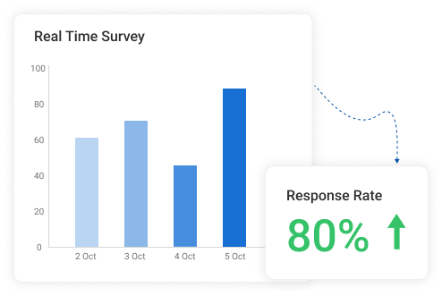
Before you do anything clever, get the simple picture. How many people responded to each question? What was the average score? What percentage picked each option? This is your foundation. A survey tool like ProProfs AI Survey Maker will surface these numbers automatically in a summary dashboard, so you are not calculating them by hand. In fact, people genuinely appreciate the reporting and analytics:

Step 6: Look Beyond the Average
An average can look perfectly fine while hiding a deeply divided audience underneath it. Always check how spread out the responses are before you draw any conclusions from a single number. Look for question-level breakdowns that show you exactly what percentage of respondents gave each rating, not just the mean.
Step 7: Break the Results Down by Group
Split your results by location, age, job role, tenure, or whatever matters most to your research question. Overall scores almost always mask the most important story sitting just underneath them. Most modern survey tools let you filter responses by demographic variables without touching a spreadsheet.

Step 8: Compare the Groups That Matter Most
Pick two or three group combinations worth looking at side by side. This is almost always where the most useful and specific findings live.
Step 9: Read the Written Responses
Do not skip the open-ended answers. Follow the thematic coding process from the previous section and pair what people wrote with the scores they gave for the same questions. If your tool organizes individual responses alongside contact details and attempt dates, that context makes the coding process significantly faster.
Step 10: Put the Numbers and the Words Together
The scores tell you what happened. The written responses tell you why. Neither one is the full picture on its own. Together, they give you something you can actually act on. If you are running NPS surveys, a tool that automatically buckets respondents into promoters, passives, and detractors saves you this step entirely and lets you jump straight to the why.
In fact, here’s an NPS template you can use to survey your customers:
FREE. All Features. FOREVER!
Try our Forever FREE account with all premium features!
How Does the Full Survey Analysis Process Work in Real Life?
Seeing the process applied to a real situation makes everything click. Here is a complete example from start to finish.
A SaaS company runs a post-onboarding survey after every new client goes live. They have 143 raw responses, a 10-question survey, and a quarterly review in two days. Their research question is not “how satisfied are our new customers?” but “which segments are most likely to leave in the first 90 days, and why?”
Here is exactly what they did and what they found:
| Stage | What They Did | What They Found | |
|---|---|---|---|
| Data Cleaning | Removed 14 speeders, 8 straight-liners, and 6 incomplete responses | Clean dataset of 115 responses | |
| Descriptive Stats | Calculated overall scores | CSAT: 71%, NPS: 34. Mediocre but not alarming on the surface | |
| Cross-Tabulation | Split results by customer tier and implementation type | Enterprise CSAT: 51%, SMB CSAT: 84%. Custom implementations scored 23 points lower across every metric | |
| Thematic Analysis | Read and coded all open-ended responses | Three themes across 67% of negative responses: overwhelming first week, no clear point of contact, no defined success roadmap | |
| Action Taken | Assigned dedicated CSMs to enterprise accounts, created a Week 1 Success Checklist, and produced three video walkthroughs | Targeted fixes for the three most cited pain points | |
| Results Next Quarter | Measured the same metrics across the same segment | Enterprise CSAT: 74%, NPS: 48, 90-day enterprise churn down 31% |
That is what a complete process looks like. Not a number in a dashboard. A decision, acted on, with a measurable outcome.
What Are the Most Common Survey Analysis Mistakes, and How Do You Avoid Them?
Even teams with good data and clear research questions can end up with findings that point them in the wrong direction. Here are the mistakes that show up most often and how to avoid them.
1. Stopping at the Average
A single average score feels like a complete answer. It rarely is. A score of 3.8 out of 5 can hide the fact that half your audience loves you, and the other half is quietly looking for alternatives. Always check how spread out the responses are before you report any number as a finding.
2. Assuming One Thing Caused Another
Two things moving in the same direction do not mean one caused the other. Before acting on any pattern you spot in your data, ask what else changed in the same period and think of at least two other possible explanations. If you cannot, you are not ready to act on it yet.
3. Drawing Conclusions From Too Few People
A group of 15 respondents can produce dramatic-looking percentages that mean almost nothing. Any group with fewer than 30 responses should be treated as a hint, not a conclusion. Note it, flag it, and look into it further before making any decisions based on it.
4. Skipping the Written Responses
The written answers are the section most teams skip because they feel harder to work through. They are also the section most likely to explain why your scores look the way they do. Skip them, and you will always know what happened but never quite understand why.
5. Looking at Results Without Any Context
A score on its own is just a number. Always compare your results to a previous period, an internal target, or an industry standard. Without at least one point of comparison, there is no way to know whether your findings are strong, weak, or completely average.
6. Not Deciding Upfront Who Gets to See What
Organizations want honest feedback, but also want to know which specific teams or locations are struggling. These two goals can quietly work against each other. Before you launch any survey, decide which groups you will report on and at what minimum size, and let your respondents know. People give more honest answers when they trust how the results will be used.
Your Data Has the Answers, You Have the Process
Most teams do not have a data problem. They have a process problem. The responses are there, the patterns are waiting to be found, and the decisions are sitting just underneath the surface. All that was missing was a clear, repeatable way to get to them.
Now you have that.
Clean your data before you touch it, ask the right question before you analyze it, use the right method for the right type of response, and always pair your numbers with what people actually wrote. Do that consistently, and your surveys will stop being a reporting exercise and start being one of the sharpest decision-making tools your team has.
If you are looking for a place to put all of this into practice, ProProfs Survey Maker gives you the reporting infrastructure to move from raw responses to ready-to-present insights without needing a data team behind you.
Frequently Asked Questions

Why is survey data analysis important?
Because collecting feedback without analyzing it properly is just noise. A well-analyzed survey tells you not just what your audience thinks but which specific groups think it, how strongly they feel, and what is driving those feelings. That is the difference between a report and a decision.
How many responses do I need for my results to be reliable?
It depends on what you are trying to do. For customer satisfaction surveys, 100 responses are a reasonable minimum. For NPS, aim for 200 or more. For any sub-group you plan to report on separately, you need at least 30 responses in that group before treating the findings as anything more than a directional signal
How do I analyze open-ended survey responses?
Read through all responses once to get a feel for the range. On the second pass, tag each response with one to three keywords. Group similar keywords into themes, count how often each theme appears, and rank them by both frequency and how strongly people feel about them. For larger sets, AI-assisted tools can speed up the initial clustering, but always review the output manually.
What is the difference between correlation and causation in survey analysis?
Correlation means two things tend to move together. Causation means one thing directly causes the other. Survey data can show you correlation, but it almost never proves causation on its own. Before acting on any relationship you find in your data, ask what else could explain it.
How do I present survey results to people who do not want to see data?
Lead with the finding, not the methodology. State what you discovered, what it means, and what you recommend doing about it, in that order. Use one chart per insight, keep the supporting detail in an appendix, and never make someone sit through 40 slides to get to the point.
What chart type works best for survey data?
For rating scale questions, a diverging bar chart works best because it shows both the direction and the intensity of responses at a glance. For simple yes or no questions, a bar or pie chart is fine. For tracking changes over time, a line chart is the clearest option.
How do I analyze survey data in ProProfs Survey Maker?
ProProfs Survey Maker automatically calculates scores, displays question-level breakdowns, and organizes individual responses alongside respondent details and attempt dates. For NPS surveys, it buckets respondents into promoters, passives, and detractors automatically. You can filter results by demographic variables and compare performance across time periods without touching a spreadsheet.
How does ProProfs Survey Maker help with survey data analysis?
It handles the reporting infrastructure so you can focus on interpretation. From instant analytics and real-time dashboards to demographic filtering and longitudinal tracking, it gives you everything you need to move from raw responses to actionable insights without a data team. As Justin Fredericks, Advisor at the Harvard Innovation Lab, put it: "The instant analytics and reporting gave us detailed insights on our target audience."
What is the best way to analyze survey data if I have no background in statistics?
Start with the 10-step process in this guide. Focus on the basics first: overall scores, response distributions, and how different groups answered the same questions. You do not need statistical software or advanced methods to find meaningful insights. A pivot table, a clear research question, and the willingness to read the written responses will get you most of the way there.
FREE. All Features. FOREVER!
Try our Forever FREE account with all premium features!
 We'd love your feedback!
What did you like & how can we make it even better?

 Thanks for your feedback!
 Ask Your Question
Have a question? Get expert help to make your decision easier.